01
The Inspiration
Inspired by where I come from.
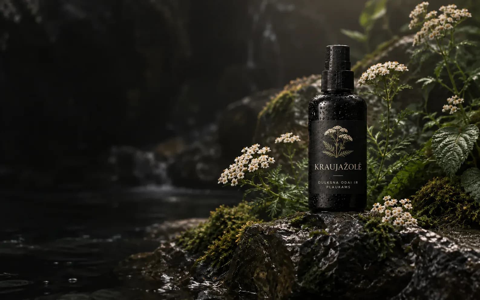
I grew up in Lithuania's Švenčionys region, known for its herbal traditions. Surrounded by forests, meadows and native plants, I wanted to turn that local heritage into something meaningful.
FOUNDER & PRODUCT DESIGNER
An independent botanical skincare venture I founded and built from the ground up.
View live website01 / OVERVIEW
A personal project that grew from a local connection to nature — turning regional heritage into a complete brand, from concept to product and digital experience.
01
Inspired by where I come from.
I grew up in Lithuania's Švenčionys region, known for its herbal traditions. Surrounded by forests, meadows and native plants, I wanted to turn that local heritage into something meaningful.
02
Bringing nature into everyday care.
Florea was born from the idea of creating botanical skincare inspired by local plants — thoughtful, accessible products for everyday skin and hair care.
03
Turning an idea into a complete brand.
I independently developed Florea from concept to visual identity, print-approved packaging and a functioning e-commerce website, connecting the physical and digital experience.
Brand Strategy & Identity
A / Product strategy
Rather than choosing products based on aesthetics alone, I shaped Florea's range around three considerations: what could realistically be produced, what people use in everyday care, and how the products could work together.
THE PRODUCT RANGE
B / Brand identity
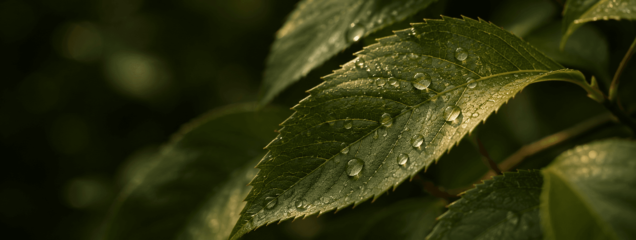
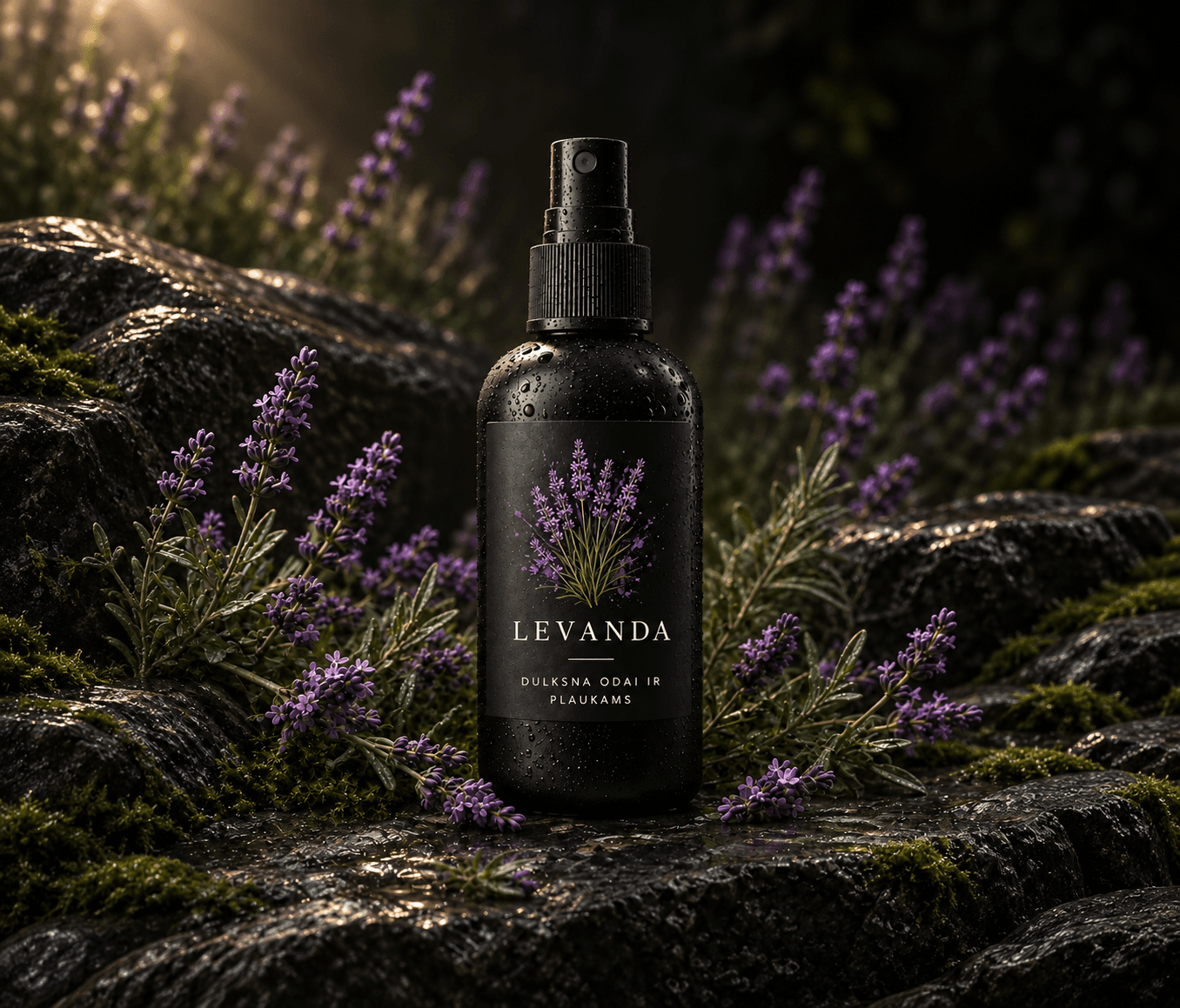
I developed a flexible visual language built around botanical illustrations, editorial typography and natural tones. Each plant gives a product its own character while keeping the wider collection recognizably Florea.
 Closer to plants.
MATERIAL & COLOR LANGUAGE
Product & Packaging System
Different products required different packaging solutions. I developed a consistent visual hierarchy across bottles and cartons, alongside standardized gift-box formats designed to support multiple product combinations.
Packaging artwork approved for printing. Product development is ongoing.
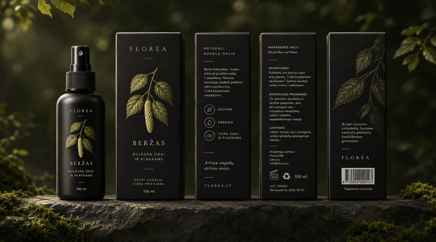
A / INDIVIDUAL PRODUCT PACKAGING
A unified system of typography, botanical illustration and clear information creates a recognizable and consistent product experience.
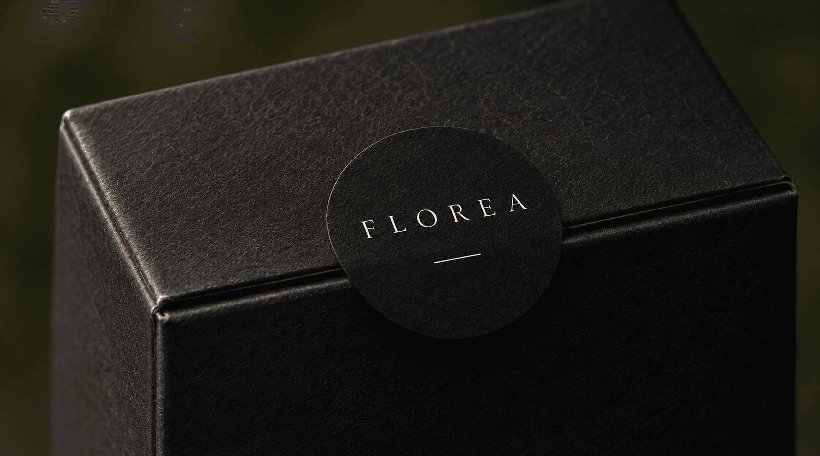
B / MODULAR GIFT SET SYSTEM
By standardizing the outer packaging and adapting the internal layouts, I could accommodate different product combinations without creating a completely separate packaging solution for every set.
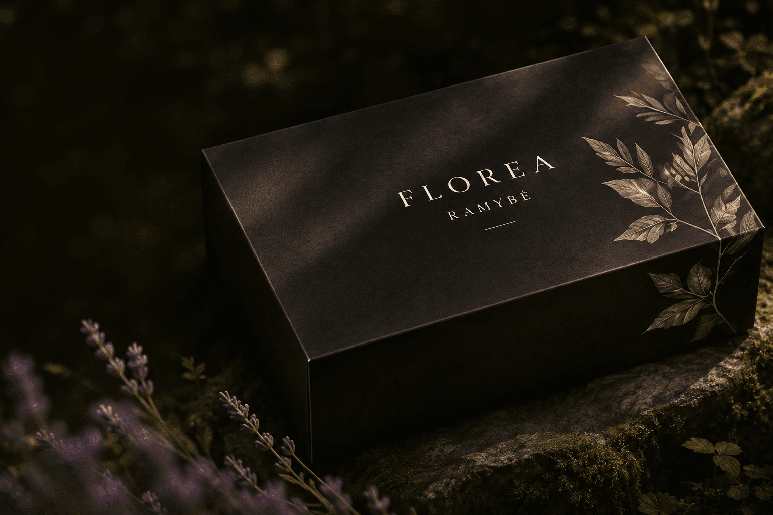
PACKAGE FORMATS
SET COMBINATIONS
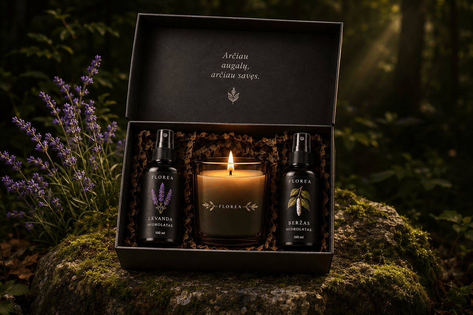
EXAMPLE SET
Two hydrosols and a candle, brought together in one coordinated gift-set format.
E-commerce Experience
I designed Florea's storefront to balance an expressive botanical identity with clear product navigation and information. The experience gives the brand room to tell its story while making individual products easy to explore.
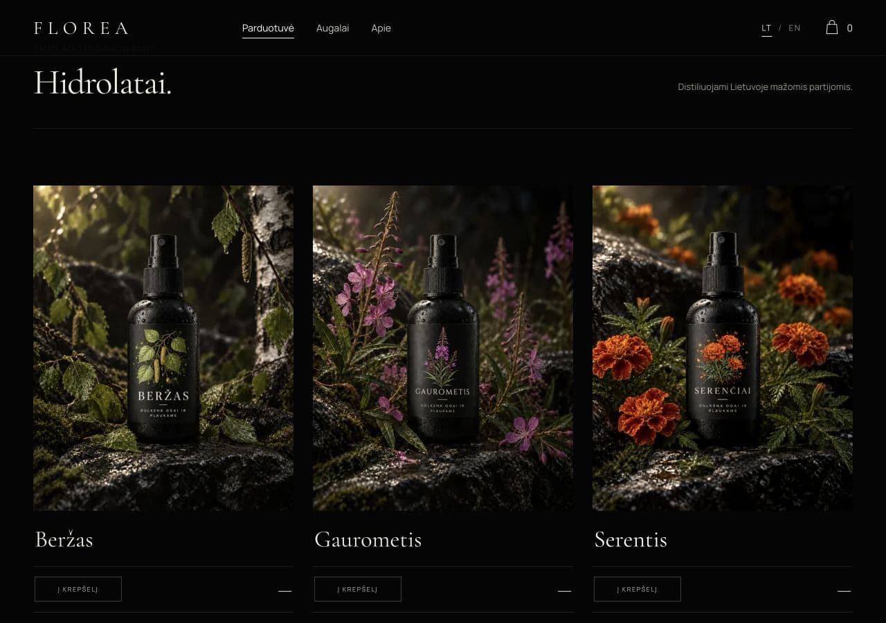
A / PRODUCT DISCOVERY
B / PRODUCT PRESENTATION
Each product has its own botanical identity within a shared interface, making product imagery, information and actions consistent across devices.
Current State & Learnings
The visual identity is established, packaging artwork is approved for printing and the e-commerce website is developed. Product development and launch preparations are ongoing.
The visual identity is established, packaging artwork is approved for printing and the e-commerce website is developed.
Building Florea taught me to balance creative direction with practical constraints — from production feasibility and modular packaging to designing a usable digital storefront.